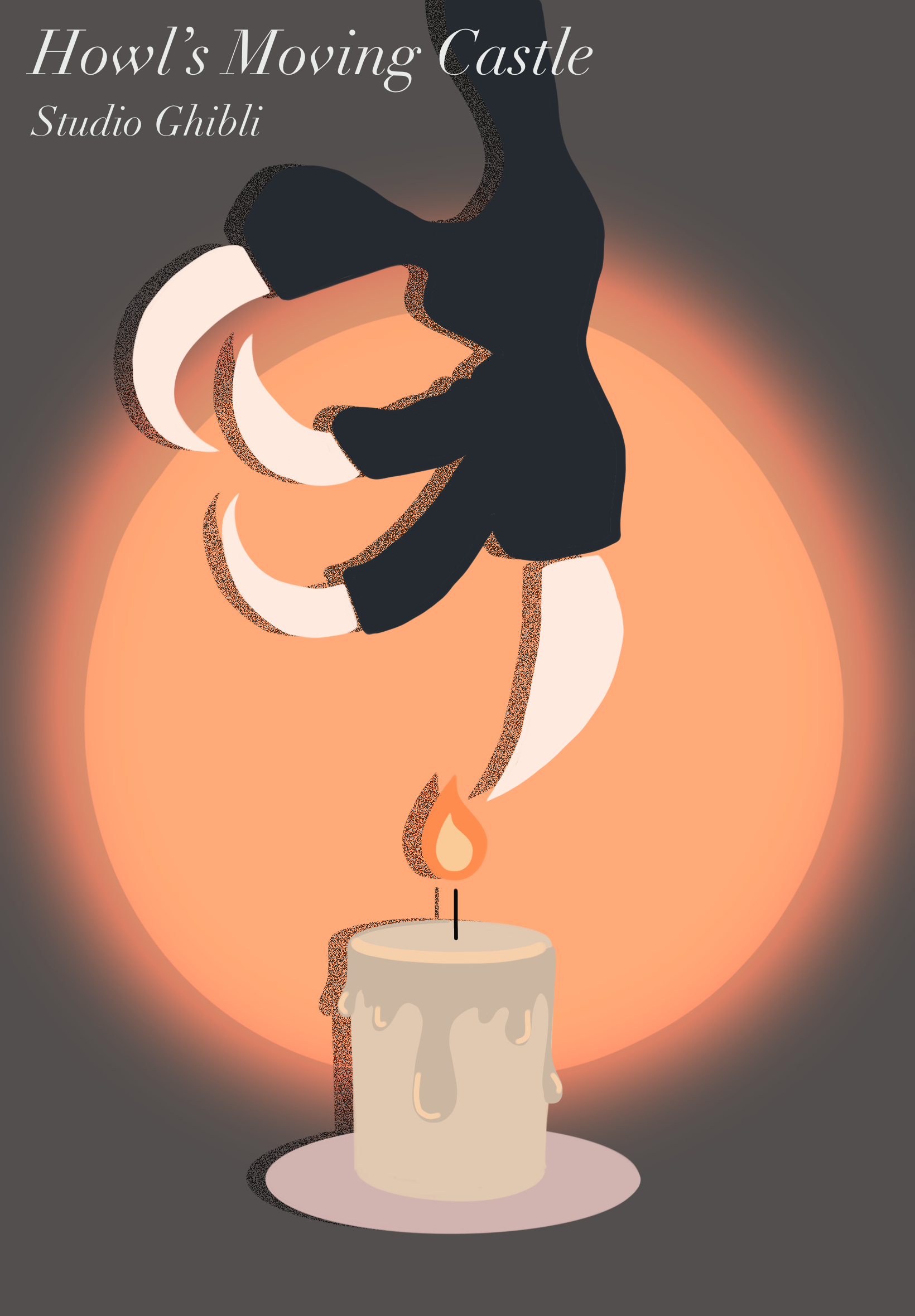
When designing this poster, I had a lot of trouble designing based on the Polish posters. I turned it in with low resolution and the feeling of defeat. Looking back, I realize that I had rushed the design process, resulting in a final product that did not meet my creative standards. Although I submitted it on time to receive a full grade, I couldn’t shake the feeling that I had been somewhat lazy in my approach. About a year later, I decided to go back and look at what I could do better. My original design was, quite frankly, unattractive. I wanted to take a deeper look into Polish posters and how I could redeem this design. I decided to mute the original colors, but keep the overall idea of the poster. I ditched the paper texture and the glowing effect, wanting to simplify the design as much as I could. I replaced the fonts and made them more fitting for the Polish aesthetic, making them smaller and not as in-your-face. Additionally, I incorporated a subtle “hand-stamped” effect to give the piece a more tactile and crafted appearance. This final design reflects my creative mind and capabilities much more.

The image above is the original Howl's Moving Castle poster design that I created a year prior to the one I have now. In the timelapse video, you can see the difficulties I face, like redoing the lettering over and over again. You can see that this version does not match the assignment requirements. I, instead, did my own personal style with just a touch of the polish poster aesthetic. Safe to say that the updated version fits much better.

This is the time-lapse of how I created the updated version. I simplified a lot of the details down to almost the bare minimum. I got rid of the light effects and made it more so a stamp-like aura instead. I made the lettering much smaller to match the minimalist feel of the Polish poster aesthetic.